|
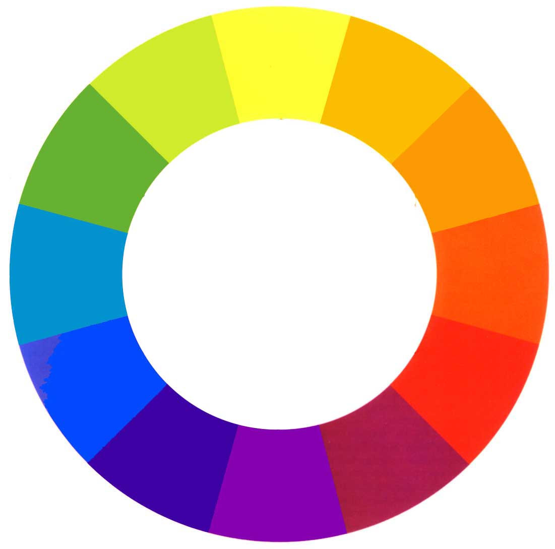
The Colour Wheel
Color theory encompasses a multitude of
definitions, concepts and design applications. All the information
would fill several encyclopedias. As an introduction, here are a few
basic concepts.
A colour circle, based on red, yellow and blue, is
traditional in the field of art. Sir Isaac Newton developed the
first circular diagram of colours in 1666. Since then scientists and
artists have studied and designed numerous variations of this
concept. Differences of opinion about the validity of one format
over another continue to provoke debate. In reality, any colour
circle or colour wheel which presents a logically arranged sequence
of pure hues has merit.
PRIMARY COLOURS
Red, yellow and blue
In traditional colour theory, these are the 3 pigment colours
that can not be mixed or formed by any combination of other colours.
All other colours are derived from these 3 hues
SECONDARY COLOURS
Green, orange and purple
These are the colours formed by mixing the primary colours.
TERTIARY COLOURS
Yellow-orange, red-orange, red-purple, blue-purple, blue-green
and yellow-green.
These are the
colours formed by mixing a primary and a secondary colour. That's
why the hue is a two word name, such as blue-green, red-violet,
and yellow-orange.
COLOUR
HARMONY
Harmony can be defined as a pleasing
arrangement of parts, whether it be music, poetry, colour, or
even an ice cream sundae.
In visual experiences, harmony is something that is pleasing to
the eye. It engages the viewer and it creates an inner sense of
order, a balance in the visual experience. When something is not
harmonious, it's either boring or chaotic. At one extreme is a
visual experience that is so bland that the viewer is not
engaged. The human brain will reject under-stimulating
information. At the other extreme is a visual experience that is
so overdone, so chaotic that the viewer can't stand to look at
it. The human brain rejects what it can not organize, what it
can not understand. The visual task requires that we present a
logical structure. Color harmony delivers visual interest and a
sense of order.
In summary, extreme unity leads to under-stimulation, extreme
complexity leads to over-stimulation. Harmony is a dynamic
equilibrium.
Some
Formulas for Colour Harmony
There are many theories for harmony. The
following illustrations and descriptions present some basic
formulas .
A colour scheme based on
analogous colours:
Analogous colours are any three colours which are side by side
on a 12 part colour wheel, such as yellow-green, yellow, and
yellow-orange. Usually one of the three colours predominates.
A colour scheme based on complementary colours:
Complementary colours are any two colours which are directly
opposite each other, such as red and green and red-purple and
yellow-green. Opposing colours create maximum contrast and
maximum stability.
A colour scheme based on
nature: Nature provides a perfect departure point for
colour harmony, regardless of whether this combination fits into a
technical formula for colour harmony.
Text taken from:
http://www.colourmatters.com/colourtheory.html - you can visit
the website to see a full diagrammatic representation
|